
![]() Das O
Das O

Client:
Das O
Location:
Graz
With:
Jonas Weber
Service:
Graphic Design, Branding


The whole identity is based on the product itself: BOWLS. The concept of the restaurant is serving healthy food in bowls only – resulting in the simple yet memorable name “das O” (engl.: the O) – turning the bowls into a logo and a 360° branding.
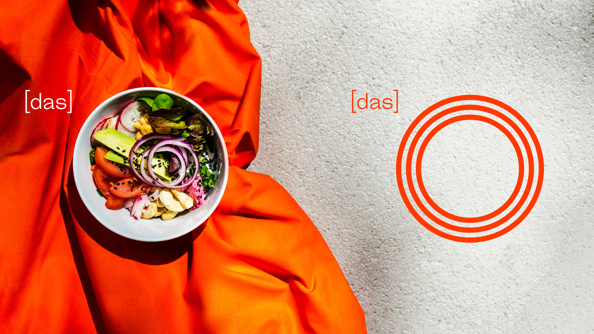


For the corporate design the base of everything was the O – evolving into more than 100 versions of the Logo, helping to communicate everything regarding the restaurant. From OOOpening Posters to sticker foils branding the space – Coasters to Menu – everything is based on the simple letterform resembling the bowl.
As simple as the idea is the colourway and typography. Orange is the only colour used for everything – and the type used is Steinbeck – a simple sans serif font with unique letters and most important: a round shaped O.

