![]() Parvenü
Parvenü

Client:
Parvenü
Location:
Weinviertel
Service:
Branding, Labeldesign & Illustration
Awards:
Bronze – CCA (Packaging)


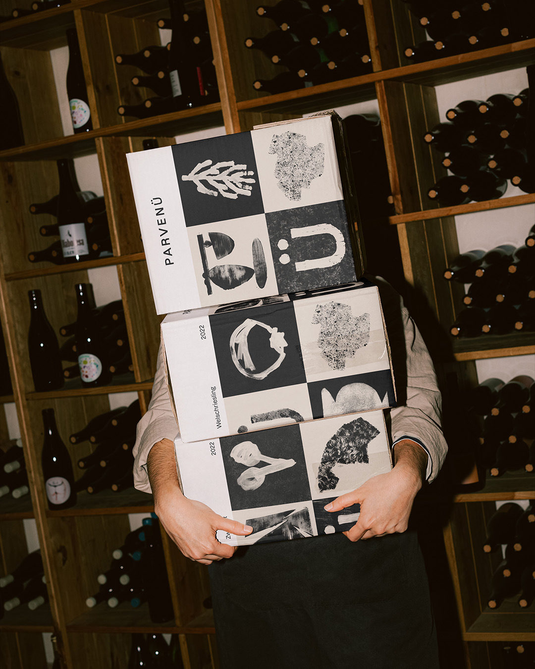

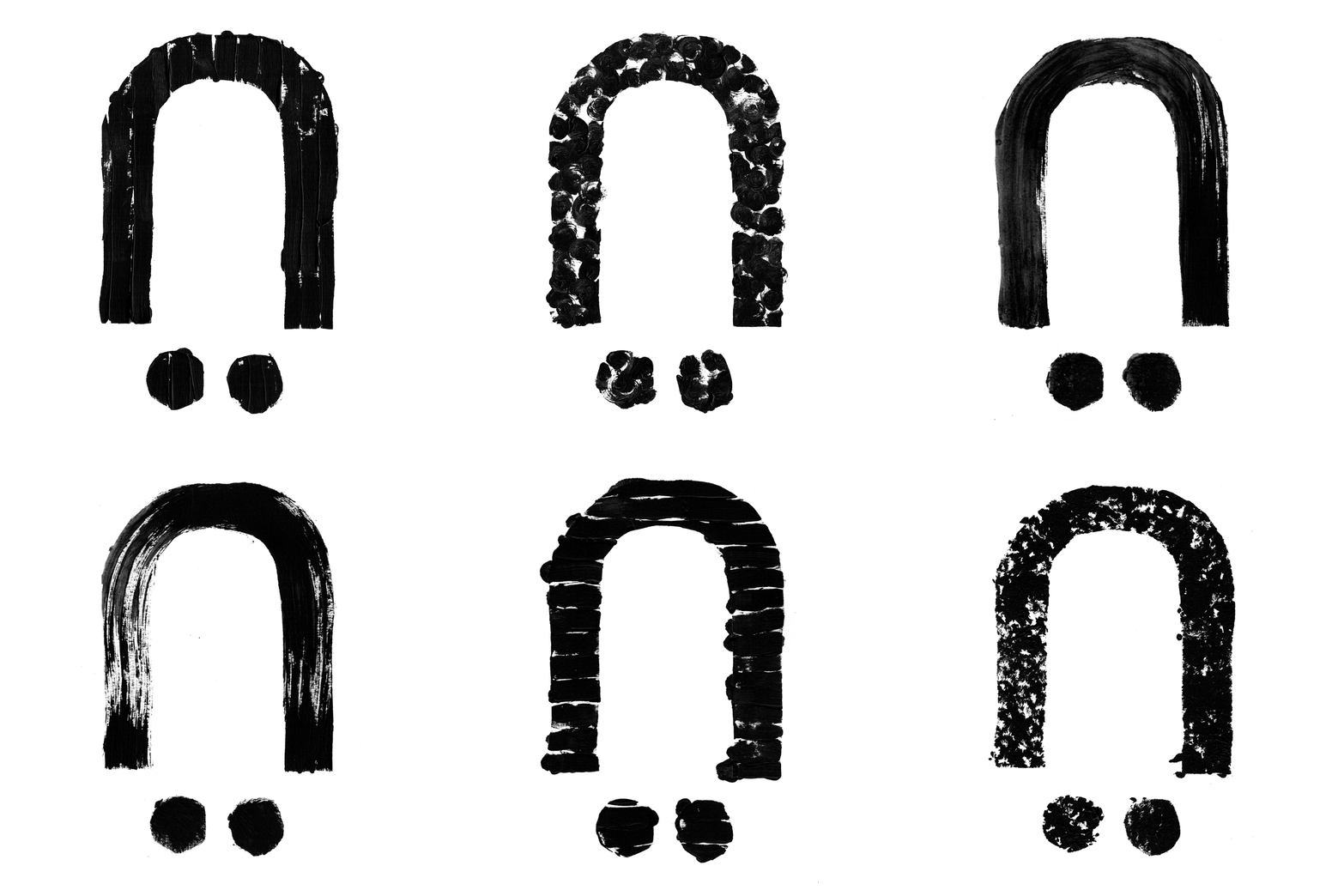
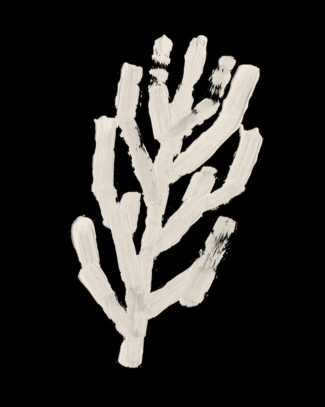
The goal was to show create an honest brand, that shows a deep rooted love and understanding of the area and its grapes. Weinviertel (which translates „wine quarter“) is the key element of the branding. The label is parted into quarters, which show the various gardens, structures and characteristic of the grapes.
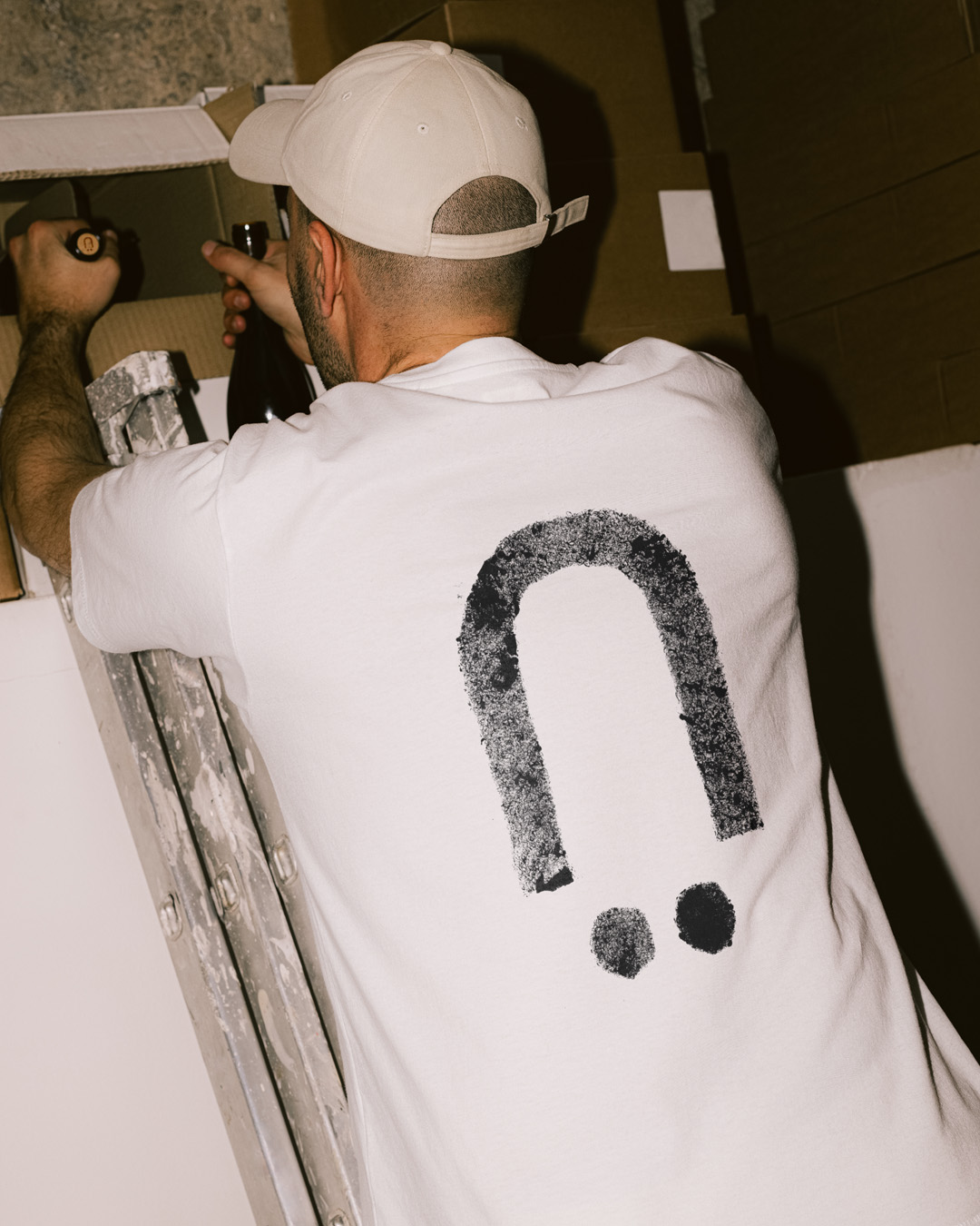
Parvenue is a french word (…and austrians have a long history with that) that refers to a person who has recently gained a social status, but is considered to lack the refinement associated with the new position. What a perfect brand name for this crew: Wine lovers (with a deep understanding) from various backgrounds who just don’t give a f* about the do’s and dont’s. They aim to produce high quality, low intervention wine. With lots of love and experience. That, you can taste in each bottle.
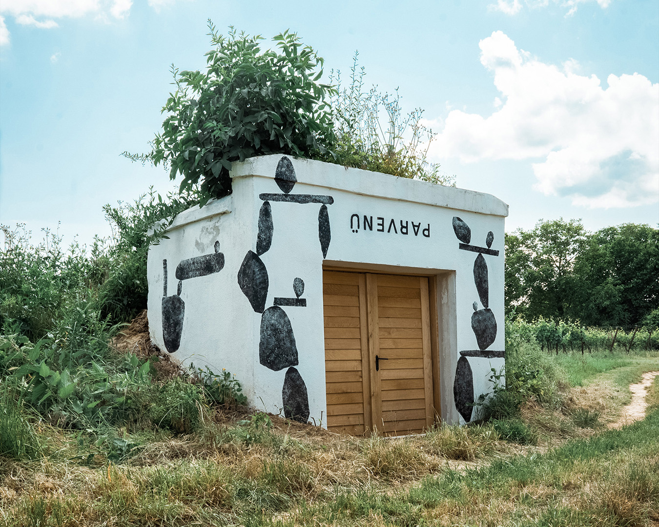




Because a parvenue doesn’t follow old patterns and rules, we decided to paste the label upside down. First, because it underlines the breaking of conservative rules. Secondly, natural wine often needs a flip so that the natural ingredients who often stay at the bottom get a slow shake. It’s a branding win–win.
